
Automating design work for simpler user flows with AI
AI Component Decision Layer
- Role
- Product Design & Design Systems
- Context
- Internal design tooling, enterprise product
I want my week going to the flows where the answer isn't obvious. That's the part of design that's actually hard, and it was permanently stuck behind something else. The tenth list page. The fifth create form. Screens whose answer the team settled months ago, that still had to come through me because the answer lived in my head and nowhere else. So I wrote it down. A decision layer sitting on top of the component library, in text a machine can read, carrying the judgment those screens depend on. The routine ones now get built without me. I spend the week on the ones that need a designer.
Two kinds of work, one queue
Product design has a genuinely hard flow that needs a point of view, and it has a routine screen whose answer was already implied by decisions the team made months ago. This is a list. Lists look like this here. Here's the component, here's the spacing.
The routine screen doesn't get better because a senior designer touched it. It just sits in front of the work that does. And it can't be handed off, because the thing a developer needs isn't in the component library.
What the components didn't say
We had a component library. Good one. It told you what a table looks like, what props it takes, how it behaves.
It said nothing about when a table is the right answer.
That gap is where I was living. Every routine screen came to me for a decision I had already made ten times: this operation is a list, so it gets the list pattern, which means this header, this empty state, this density. None of that was in the library, and none of it was written down anywhere else either. It was in my head, which is the worst possible place for a rule that gets applied weekly.
So the layer I was missing wasn't more components. It was the decisions that pick between them.
The decision layer
I wrote the system as text, as a closed world. Every screen pattern the product uses, every component, and for each one the condition that triggers it. Not the anatomy, the trigger. When does this apply, and what does it rule out.
Then a hard constraint on top: nothing outside the list gets invented. If a screen needs something the world doesn't have, that's a documented gap, not permission to improvise.
That constraint is what makes the layer worth anything. A system that can be extended on the fly by whoever is building at the time isn't a system, it's a suggestion.
What a rule actually looks like
Take the argument every product team has on repeat. Someone needs to create a thing. Where does that happen?
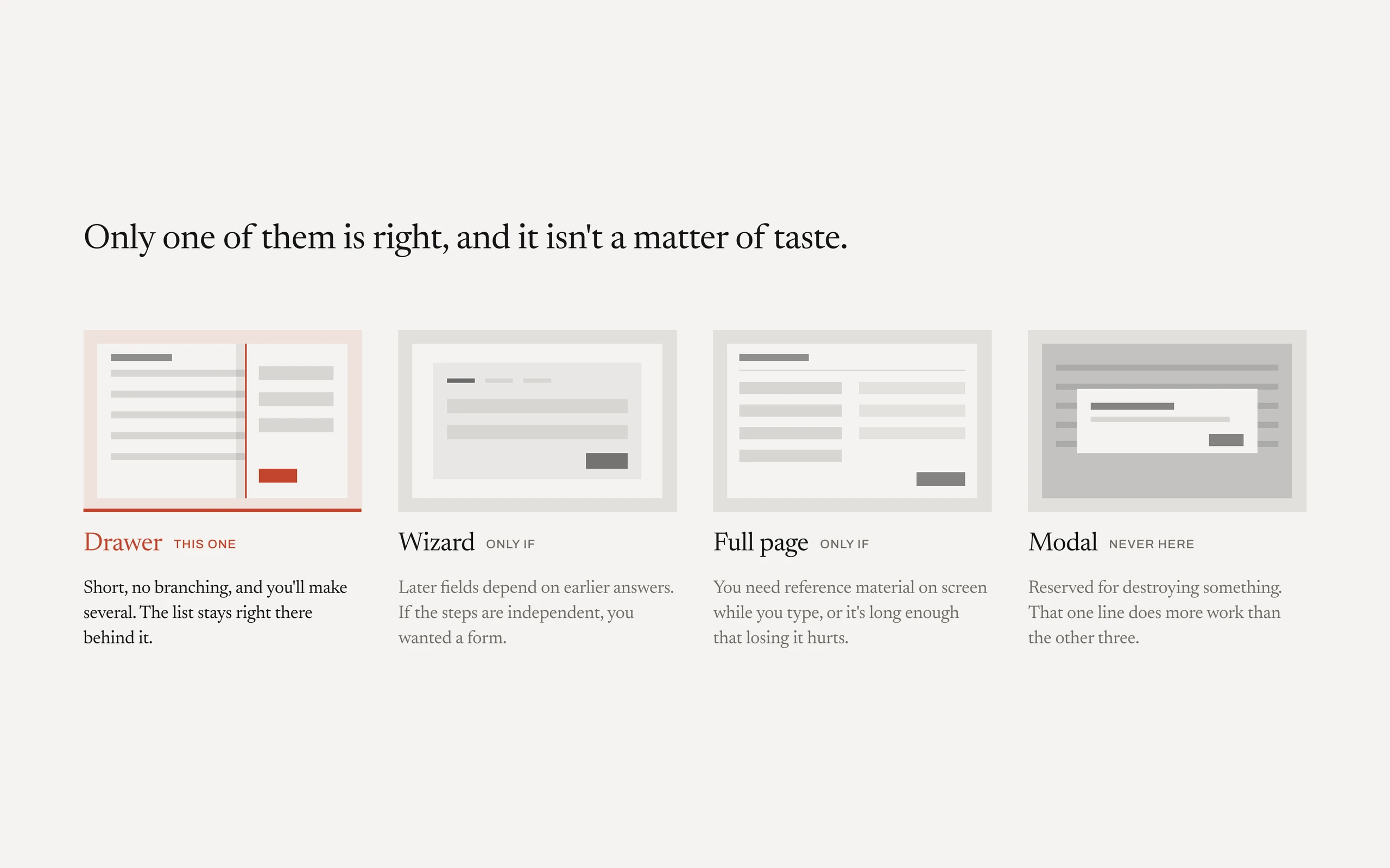
The library has a drawer, a modal, a wizard, and a full page. All four are built, documented, and correct. None of that tells you which one this case gets, and that question came to me every single time.
So the layer answers it with conditions instead of preferences.
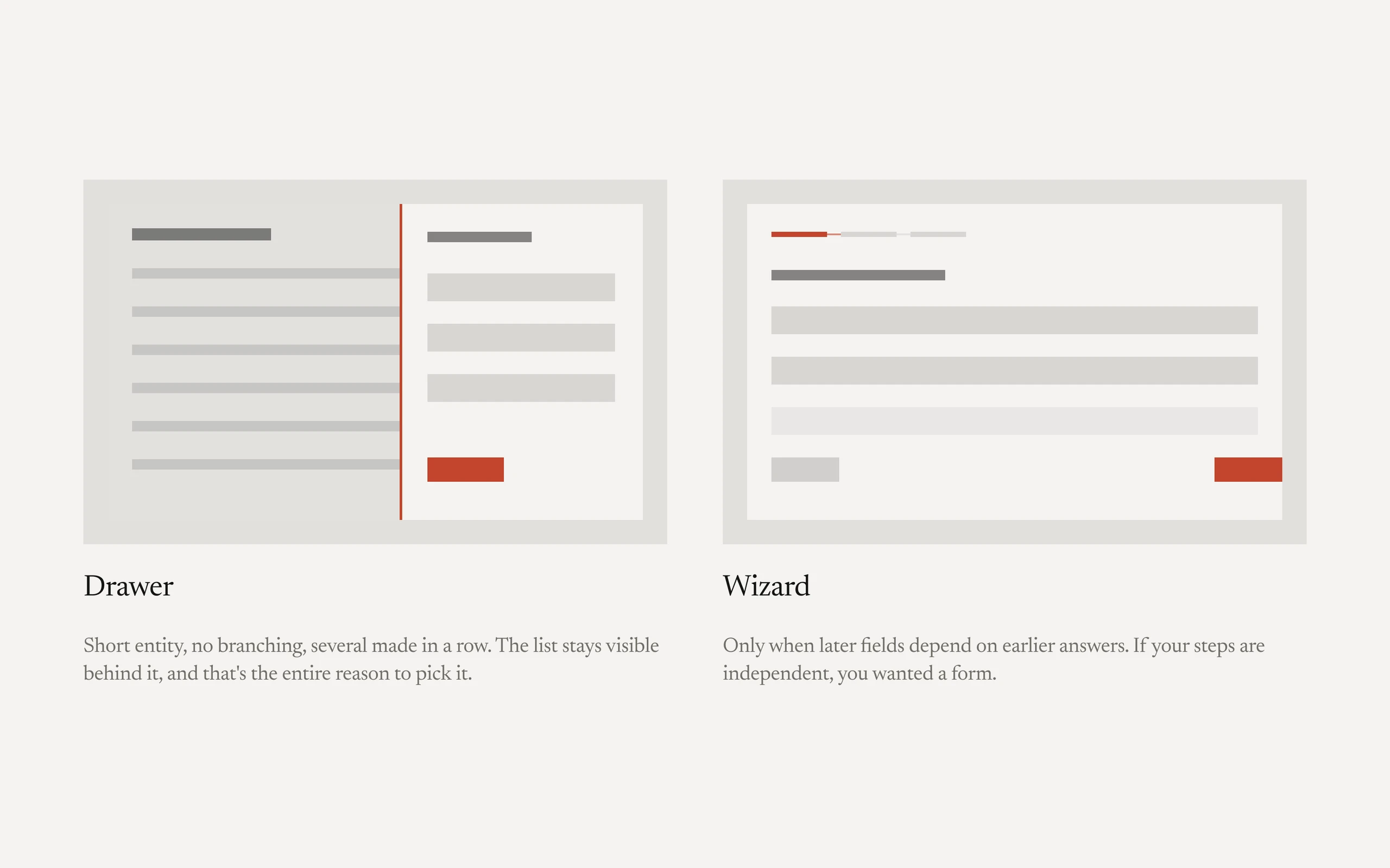
A drawer when the entity is short, has no branching, and the user is going to create several in a row. The list stays visible behind it, which is the entire reason to pick it.
A wizard when later fields depend on earlier answers, or when the thing can't be validated until a whole set is filled in. The steps have to be the point. If the steps are independent, you wanted a form.
A full page when creating requires reference material on screen at the same time, or the input is long enough that losing it hurts, or someone needs to link to it half-finished.
A modal for nothing in this product except destroying something.
That last line does more work than the other four. Most of the value here isn't what each pattern is for. It's what each one rules out.
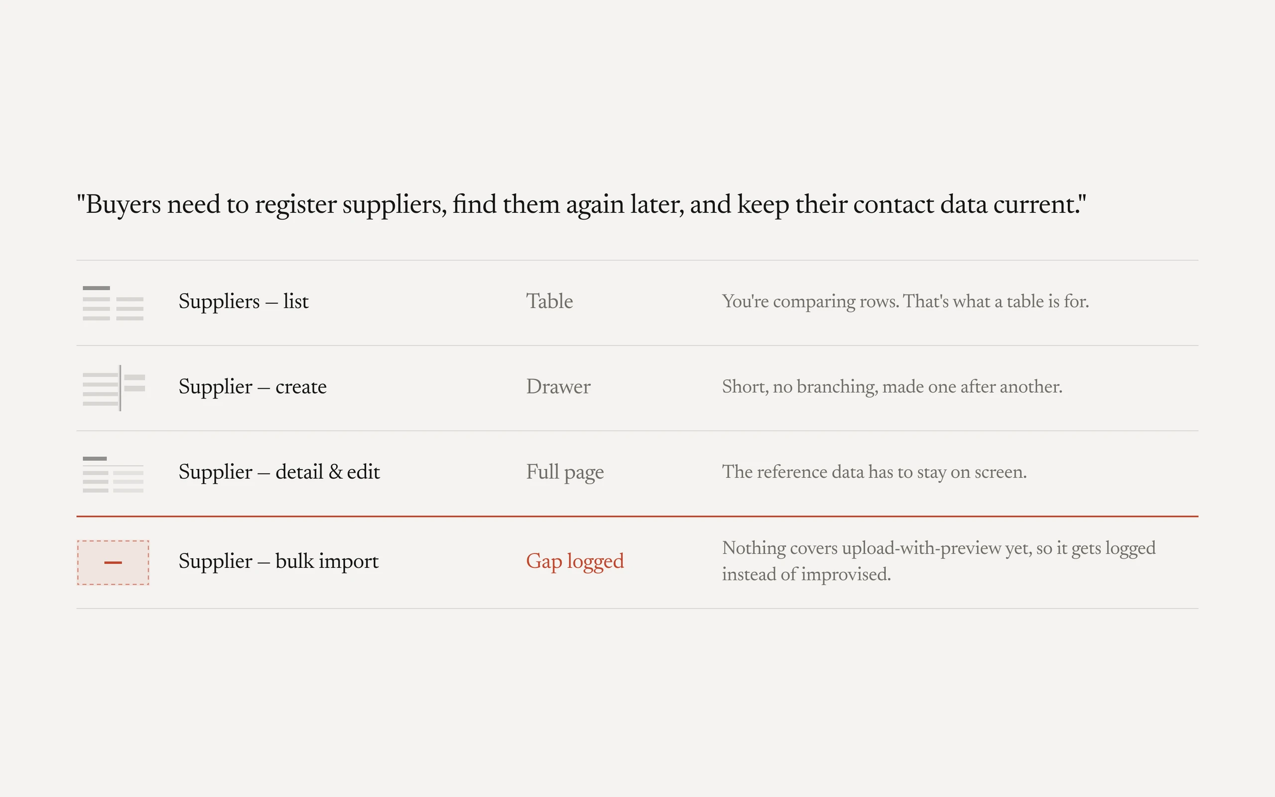
The rest of the layer has the same shape. A table wins when comparing across rows is the job, cards win when the image is the identity. An empty state has three variants and choosing wrong is the most common mistake in the product, so each one carries its own trigger: never used, filtered to nothing, failed to load.
Decisions
Encode the trigger, not the anatomy. Most design documentation describes what a component is. Mine describes when it wins. A table beats cards under these conditions; a drawer beats a page under those. The cost is that this is dramatically more work to author, because you have to reconstruct reasoning you normally make in two seconds and never explain. It's also the only part that's actually reusable, since the anatomy was already in the library.
A closed world, with no escape hatch. Nothing gets invented outside the documented set. This blocks people, on purpose. A developer who hits a missing piece has to stop and file the gap instead of building something reasonable and moving on. That's real friction and I'd defend it, because "reasonable" applied fifty times by different people is how a product stops looking like one product.
Written as text, not as a file. The layer lives in plain text next to the code, not in a design tool. It's less pleasant to read and it duplicates things a library page shows better. What it buys is that a machine can read it, which turned out to be the whole point.
A gap is a first-class object. Missing components get logged as gaps with the case that exposed them, rather than being quietly worked around. It's slower in the moment. Over a few months it turned into the most honest backlog the design system has ever had, because every item on it came from a real screen that needed it.
The routine work leaves my queue entirely. Once the triggers were written down, a spec could turn into a correct, on-system screen without me. I gave up being in the loop on every screen, and with it the small daily reassurance of having seen everything before it ships. What I got back is my time on the flows that actually need design, and a system that stays consistent whether I touched the screen or not.
What it unlocked
The layer was the precondition for everything built after it, and none of that would have worked pointed at a component library alone.
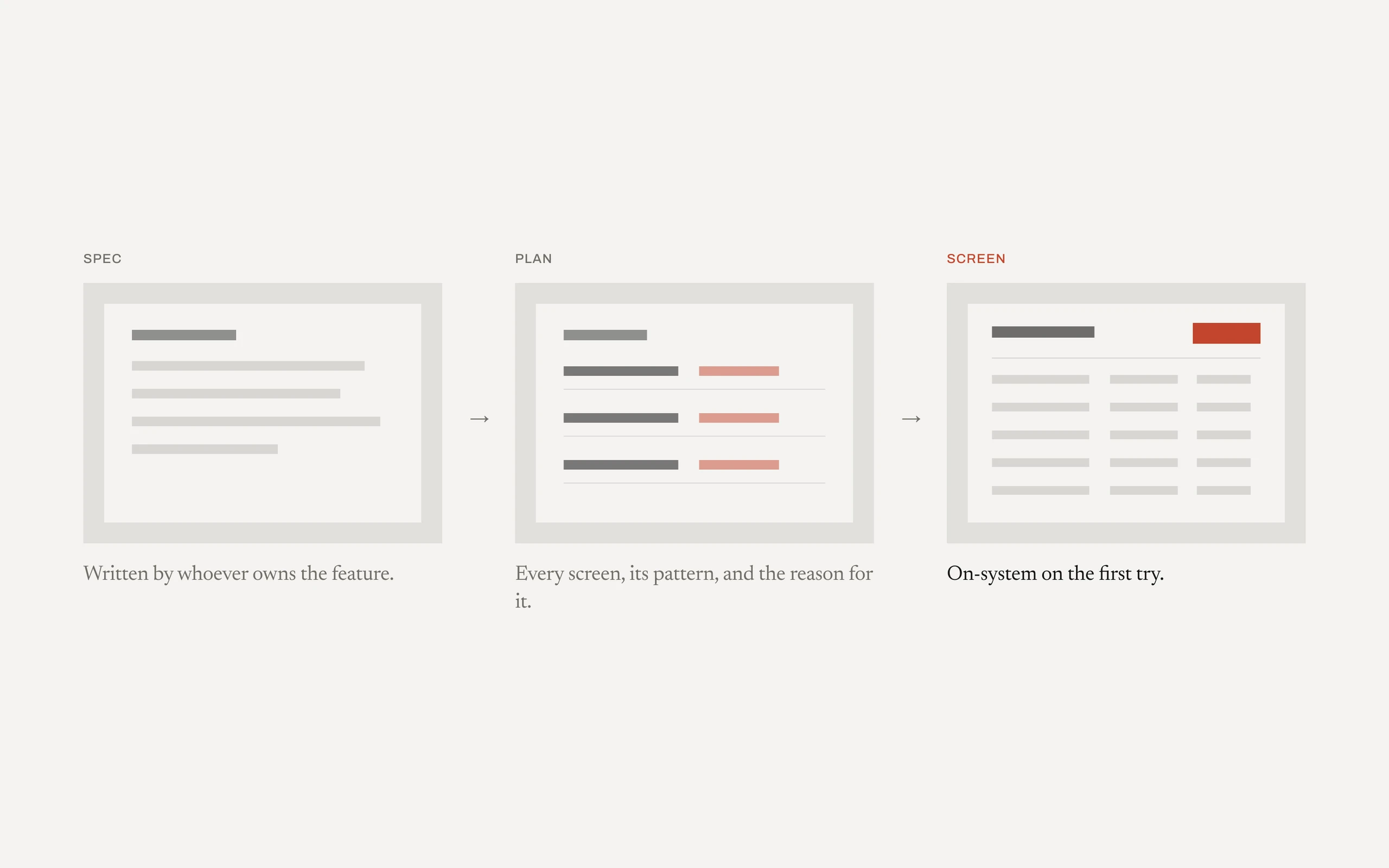
A planning pass reads a spec and returns the screens, the pattern each one follows, the components to use and why, and anywhere a component is missing. It decides and writes no code. When a real fork depends on something the spec left open, it stops and asks instead of guessing.
The build runs inside the closed world, so it reaches for the documented component instead of inventing one, and a routine screen comes out looking like the rest of the product on the first pass.
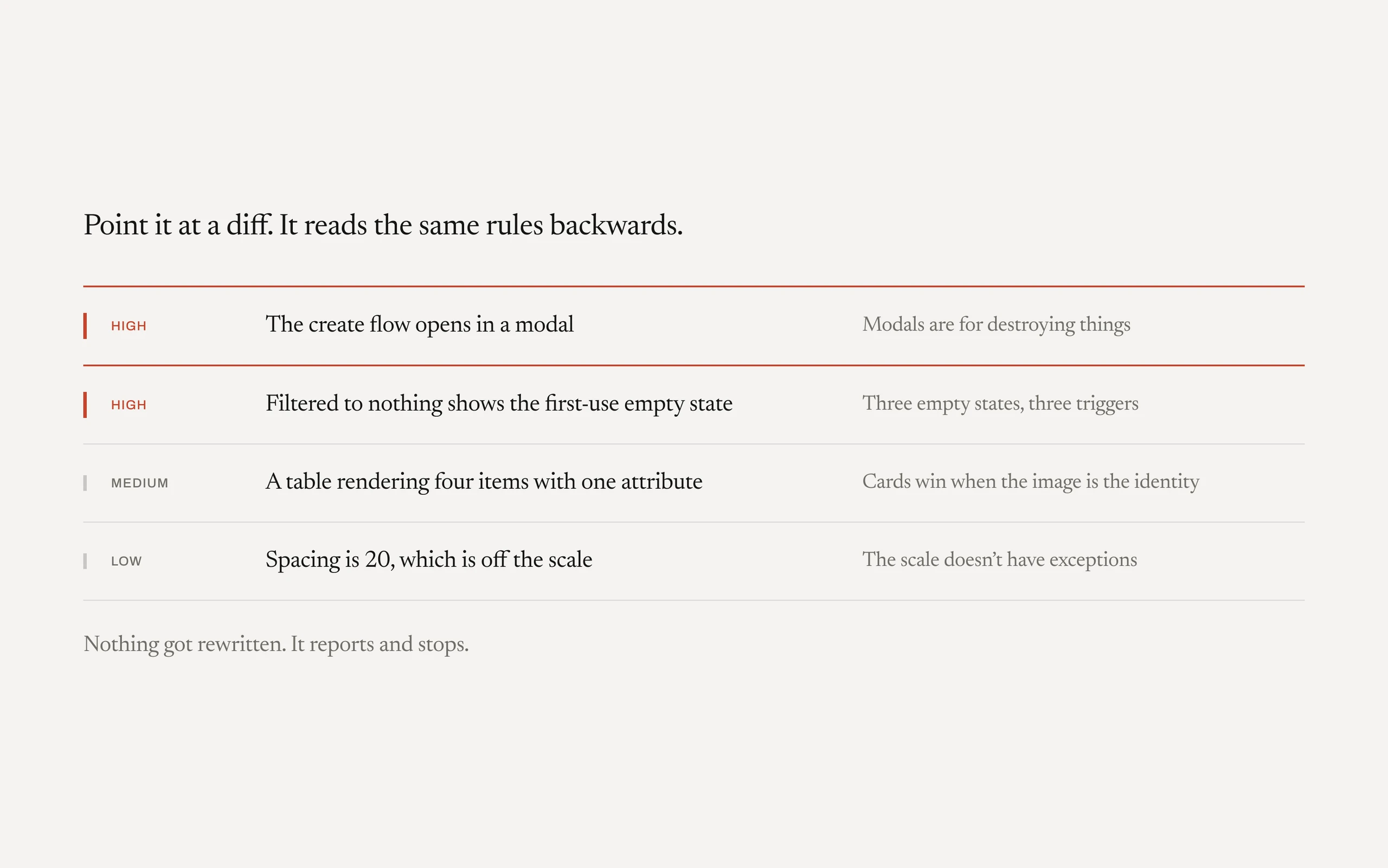
A review pass runs the layer backwards. Point it at a screen or a diff and it audits conformance against the same rules, cites the rule behind each finding, and never rewrites anything. That's the design review I used to do by hand on every pull request, now something anyone can trigger.
Outcome
Routine screens stopped routing through me, and what replaced me holds on its own.
- Routine screens ship without me. A list page or a standard form goes from spec to an on-system screen without a designer drawing it, and developers stop waiting on design for work that was never in doubt.
- My week goes to the hard problems. The queue of small decisions I had already made is gone; what's left is the flows that need a point of view, plus keeping the layer honest. That reallocation was the entire point.
- Consistency is time. When the output is dictated by the design system and its rules, the hours that used to go into revisions and adjustments come back.
- Component gaps are easy to spot. A missing piece stands out against the closed world, gets registered when it shows up, and becomes something the team and I can actually pick up and work on.
Depth
It reads like automating the job away. It isn't, and this is the part I'd defend in a room. Every bit of judgment that used to go into drawing each screen now goes into authoring the layer that lets the screens build themselves. Deciding what's a rule and what's an exception, keeping the closed world honest as the product grows, knowing which trigger is load-bearing. That work needs someone who has sat with the problem. I automated the drawing. I didn't automate the deciding.
Handoff stopped being a task. An agent mirrors the built interface back into the design tool by cloning from the library rather than redrawing, and validates every color and spacing value against the theme. A second, read-only pass flags drift between twin screens and off-token values. Handoff and design QA used to be hours of careful, unglamorous work per feature.
The gap list is the best artifact. I expected the layer's value to be speed. The thing I actually use most is the list of documented gaps, because it's the only record I've had of what the system is missing that came from real work instead of from a designer's audit.