An app that succeeds when you put the phone down
Thing
- Role
- Product Design & Creative Direction
- Team
- Solo
- Timeline
- Two weeks
- Context
- Config Makeathon · Figma, 2026
- Live
- thing.figma.site
Hobby discovery apps are a crowded category, and every one of them is built on the same contradiction. They're attention products, but the thing they're actually selling only happens once you're off the screen. I built Thing around that problem instead of pretending it isn't there. One loop, about ninety seconds, then it wants you to put the phone down.
Problem
Most hobby apps are built like content apps. You browse, you save, you scroll, you come back tomorrow. All of it tuned to keep you on the screen.
Making something with your hands is the opposite kind of job. You need the app for a minute or two, and then you need to leave. Every minute spent browsing is a minute nothing gets made, so the category ends up optimizing for the one behavior that means the product didn't work.
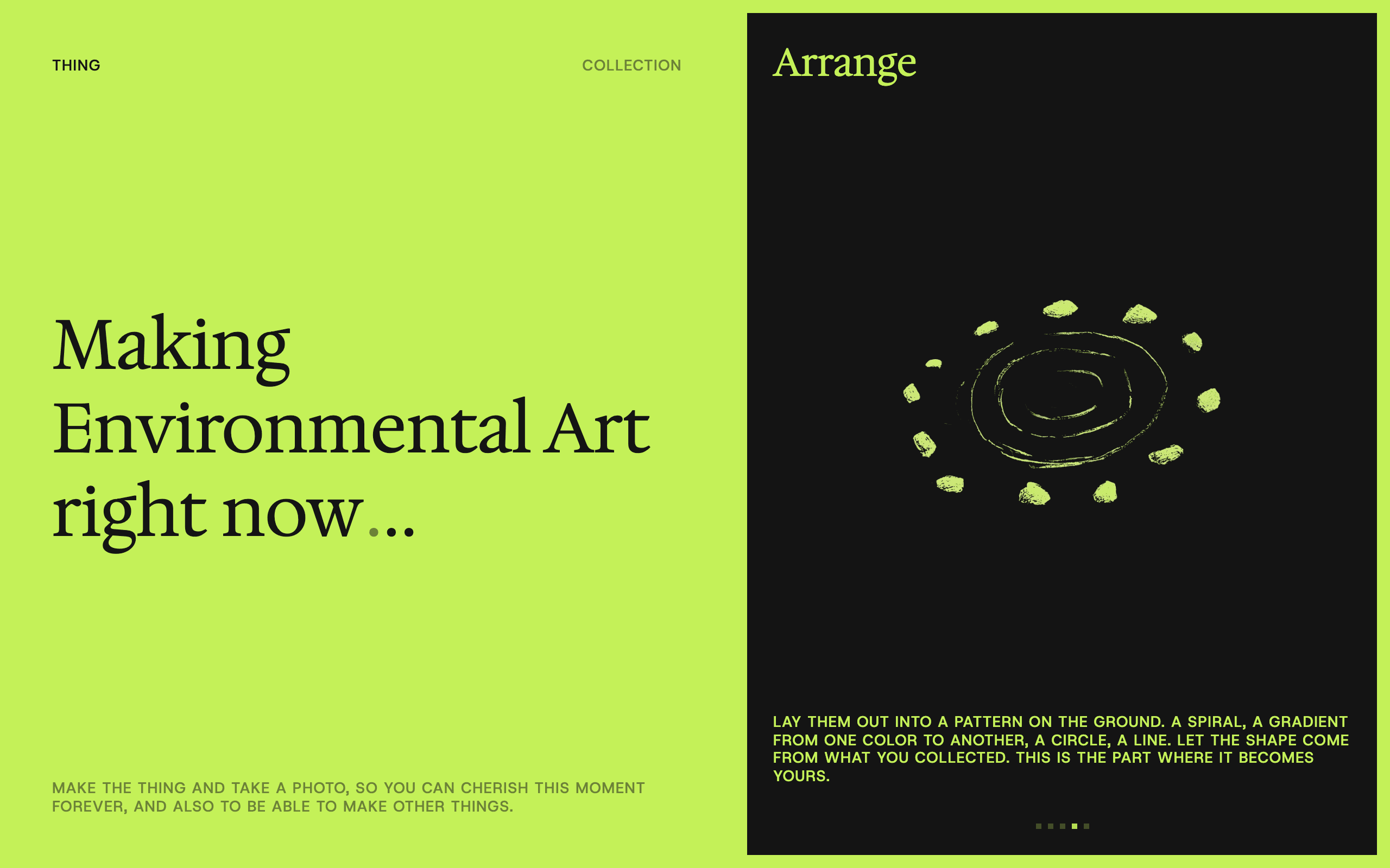
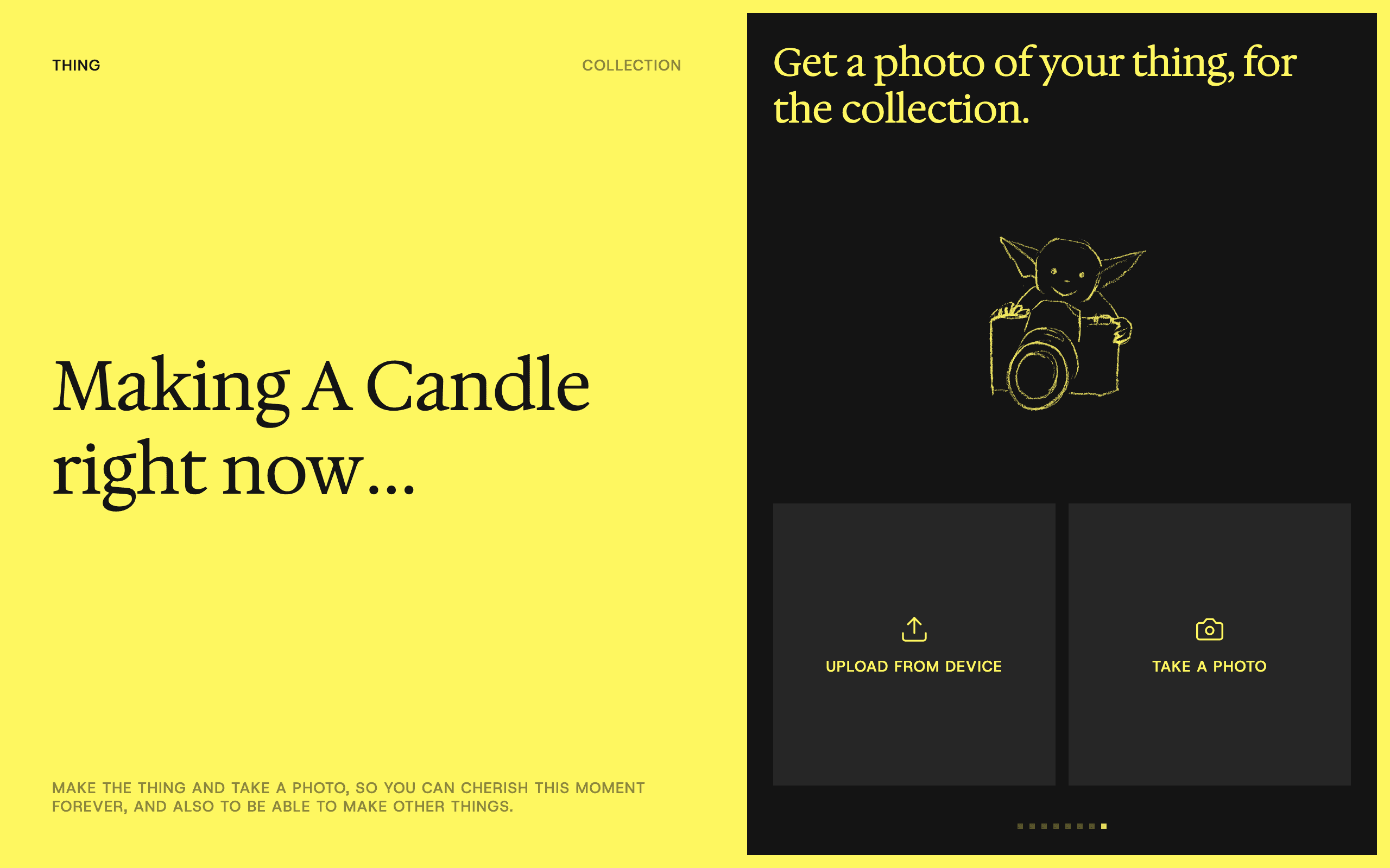
That's why I stopped calling it a hobby app. It's an app about making one thing. You pick something, get the shortest way to make it, and make it. You keep a photo at the end, then stop or start another.
Role and constraints
I did this one solo, across product, brand, and imagery, as Product Designer and Creative Director, with two weeks until the makeathon deadline. It's a working prototype built in Figma Make with an agentic workflow. As a concept it stops short of a live content pipeline, real users, or real data. The constraints that actually shaped the build are at the end.
Decisions
Every decision below is the same trade in a different form. I gave up the engagement and discovery mechanics the category runs on, and in return the product stays honest to a ninety-second job that happens off the screen.
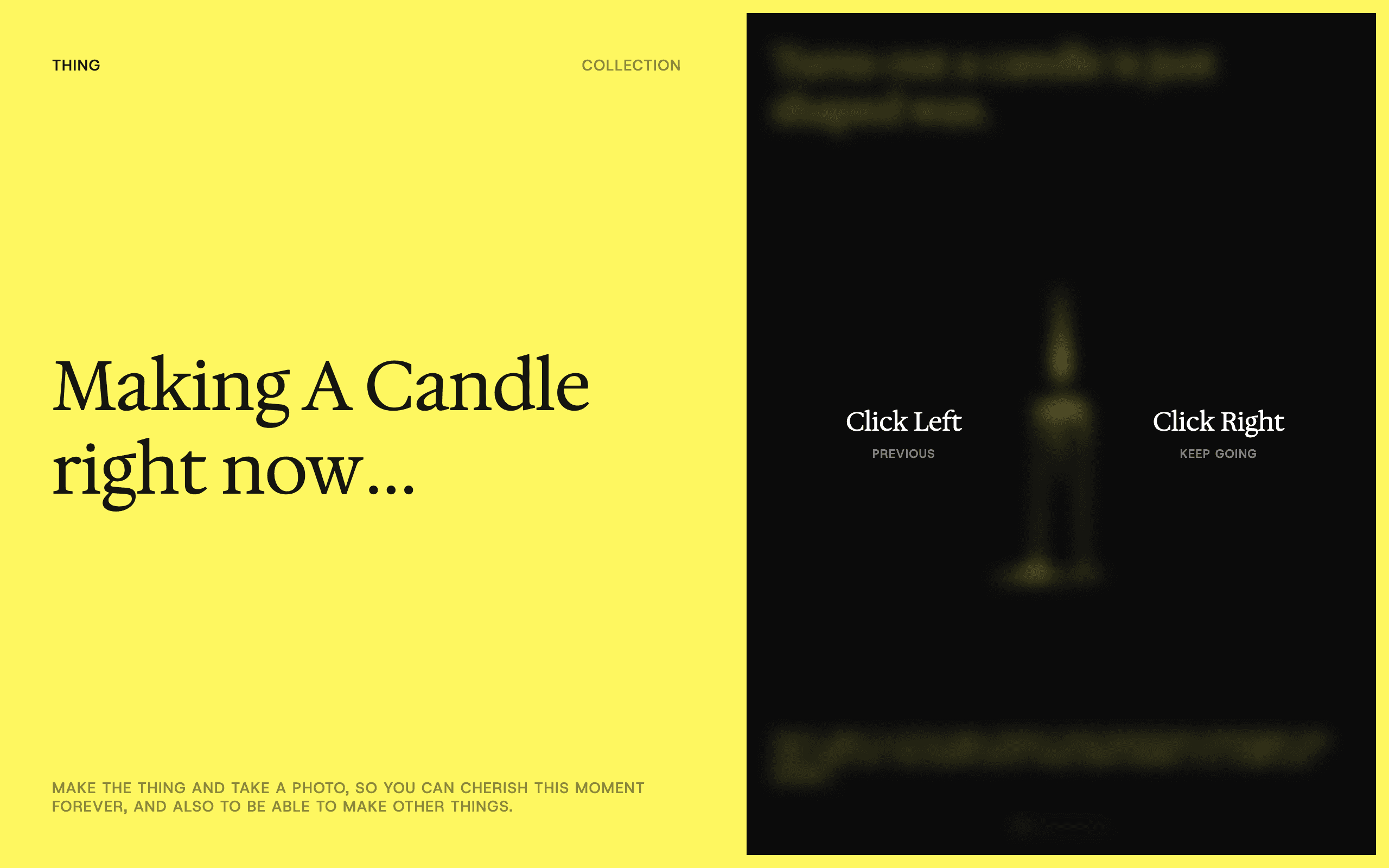
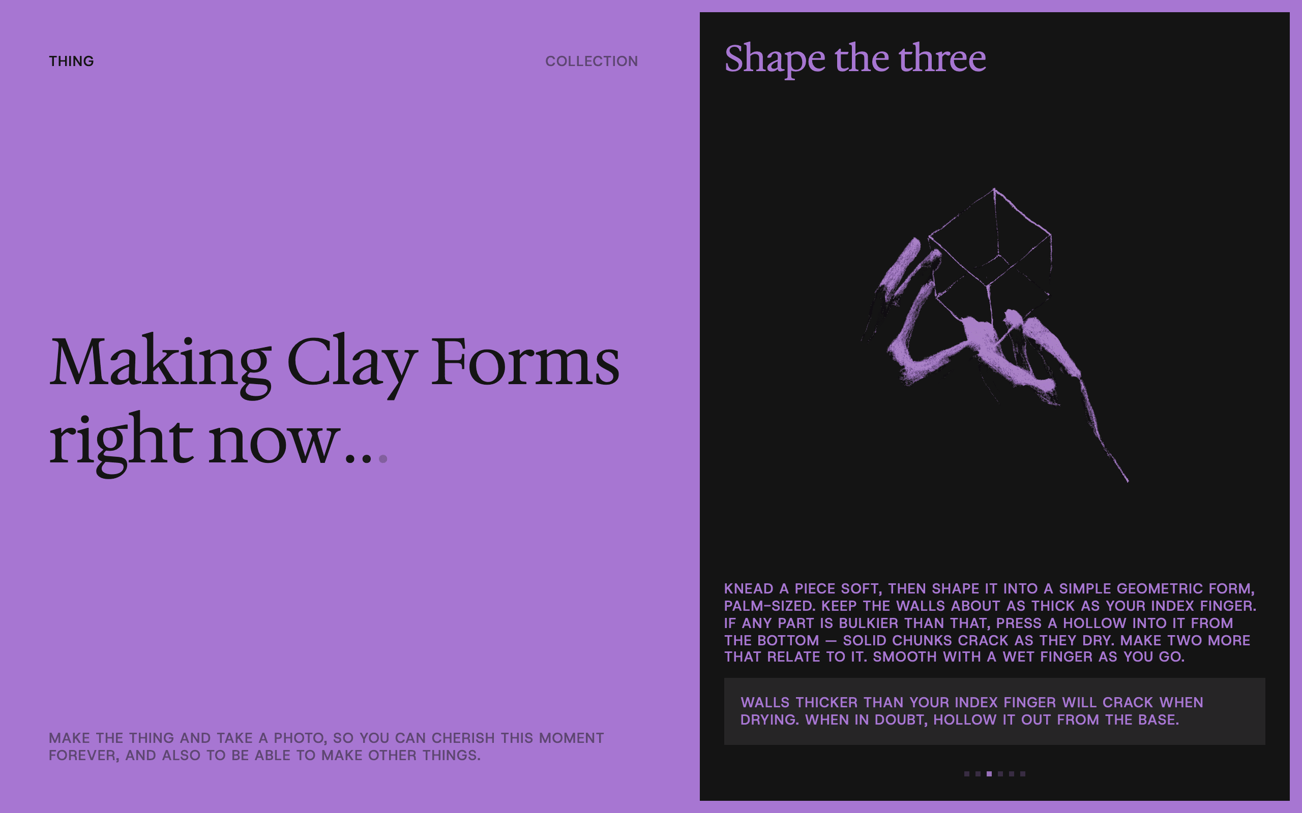
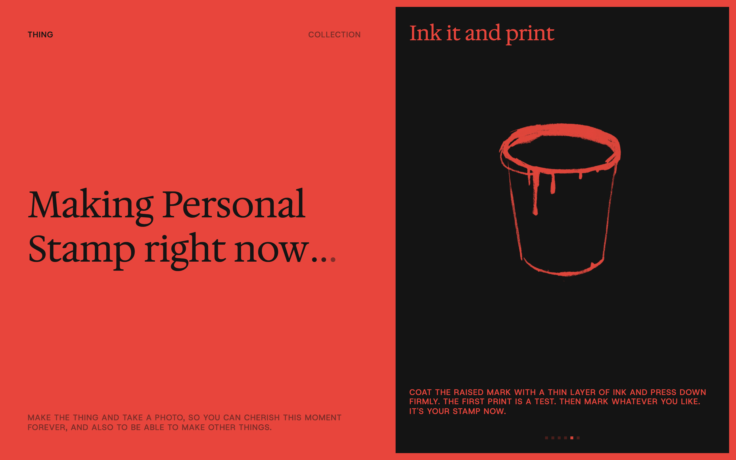
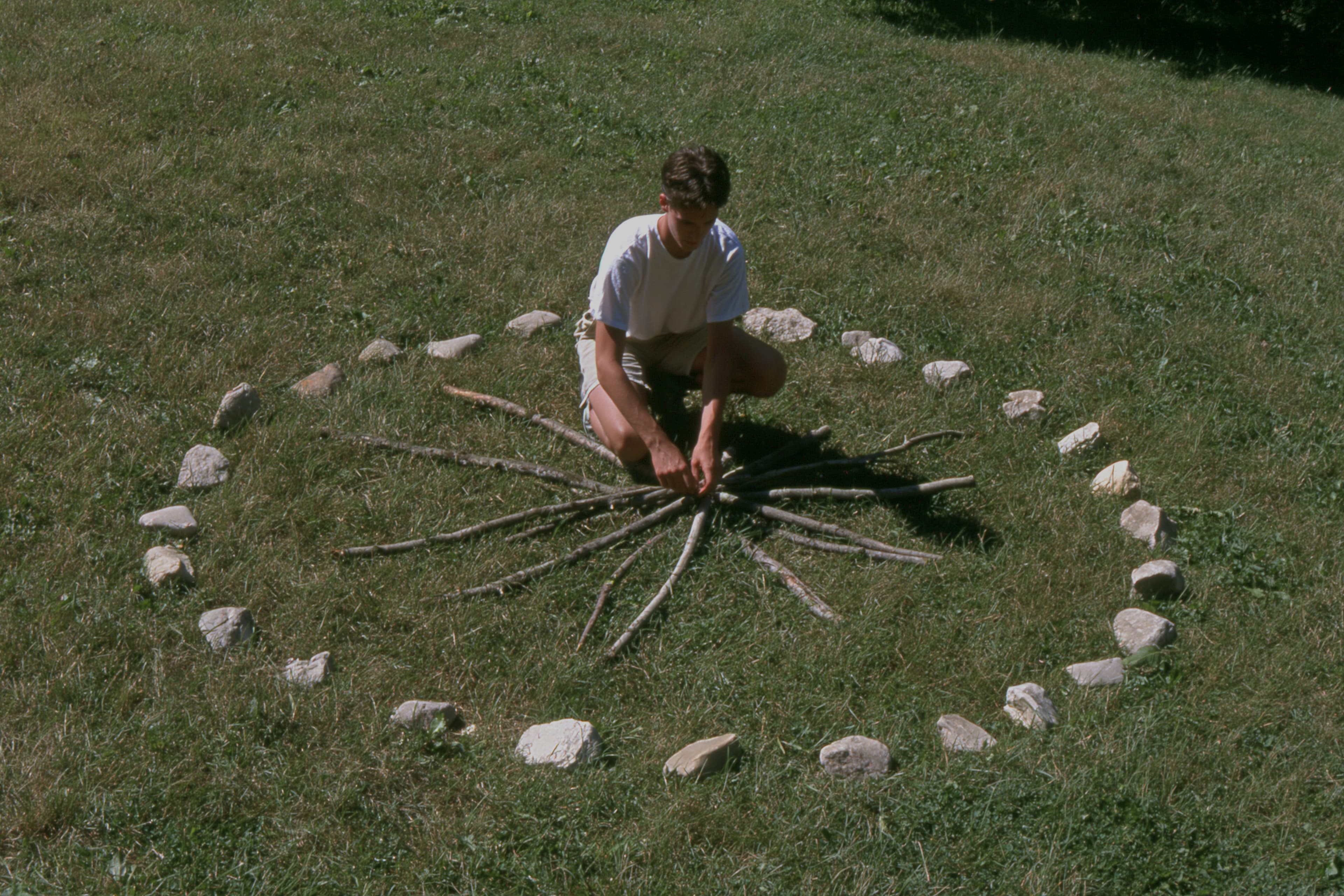
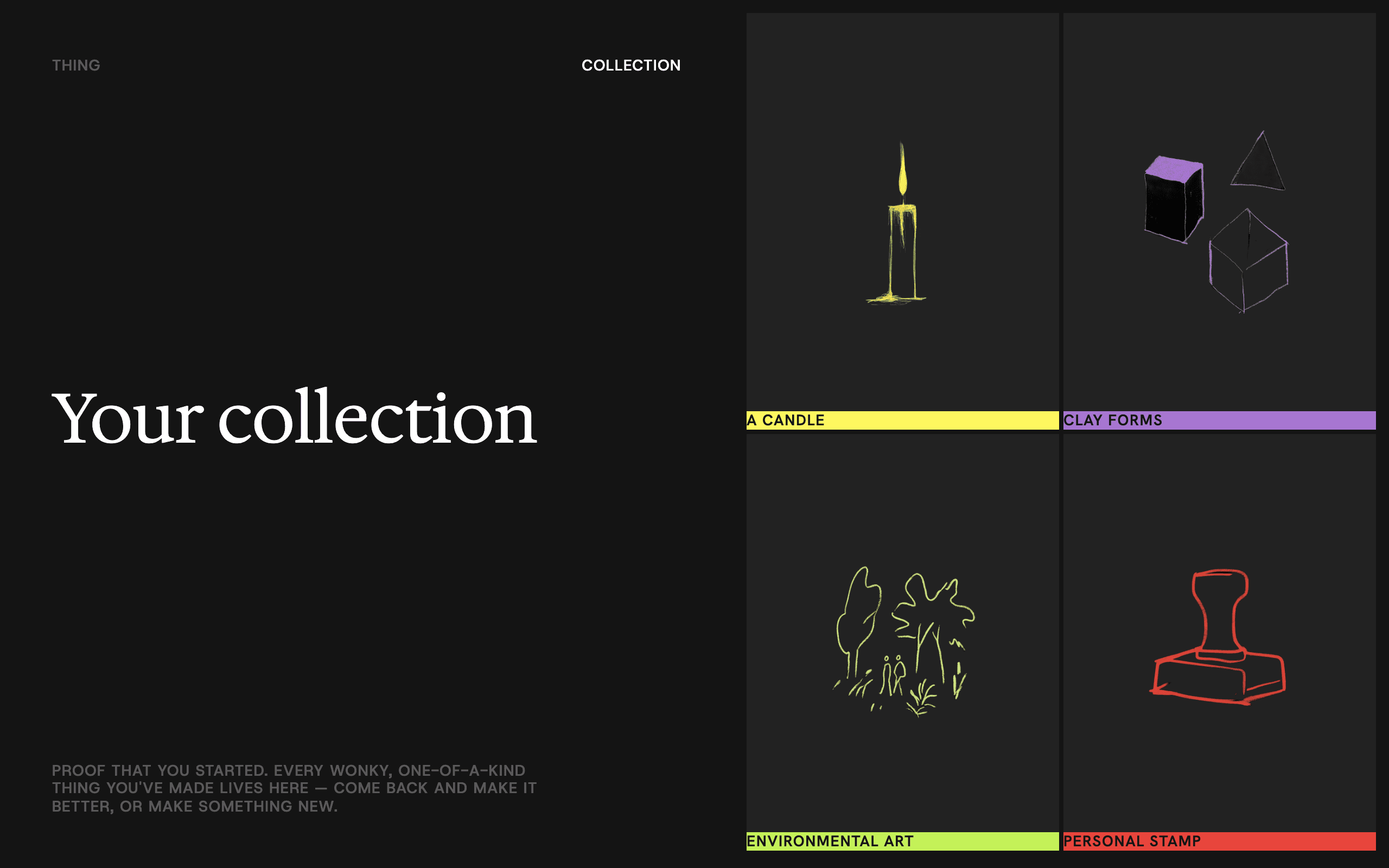
Curated around what's safe to fail at. A bad result still has to count as a result. So the four starting projects aren't there because they're easy. They're there because failing at any of them costs you nothing: a candle, an air-dry clay sculpture, a piece of land art, a rubber stamp. A difficulty ladder would have given the app a sense of progression, but it would also make the first attempt feel like something you could get wrong. Not worth it.
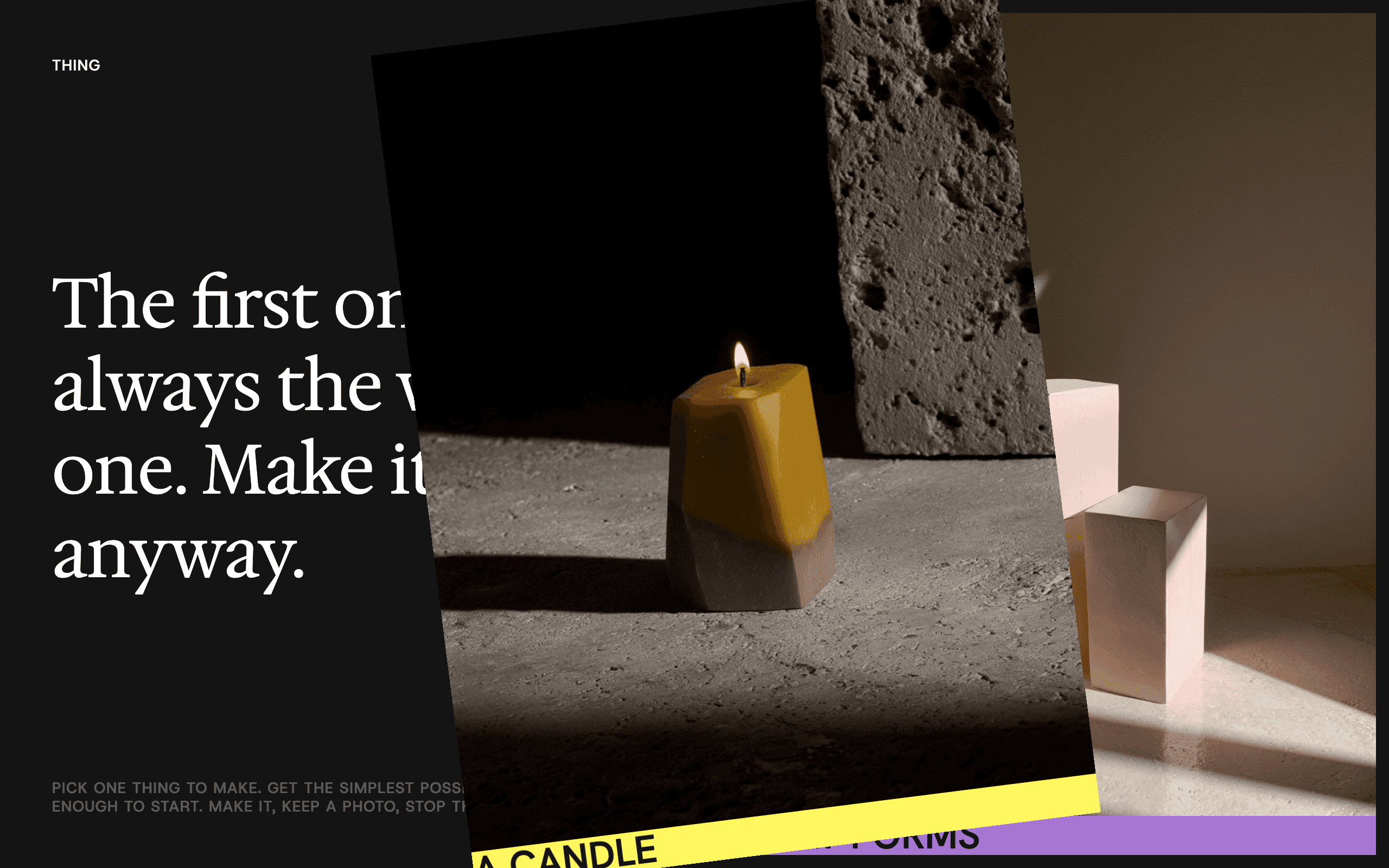
Browsing stays shallow. Browsing isn't the point, so idea mode is just a stack of cards, one thing per card. There's no feed to scroll and no search, which hands over most of the discovery the category leans on. On purpose.
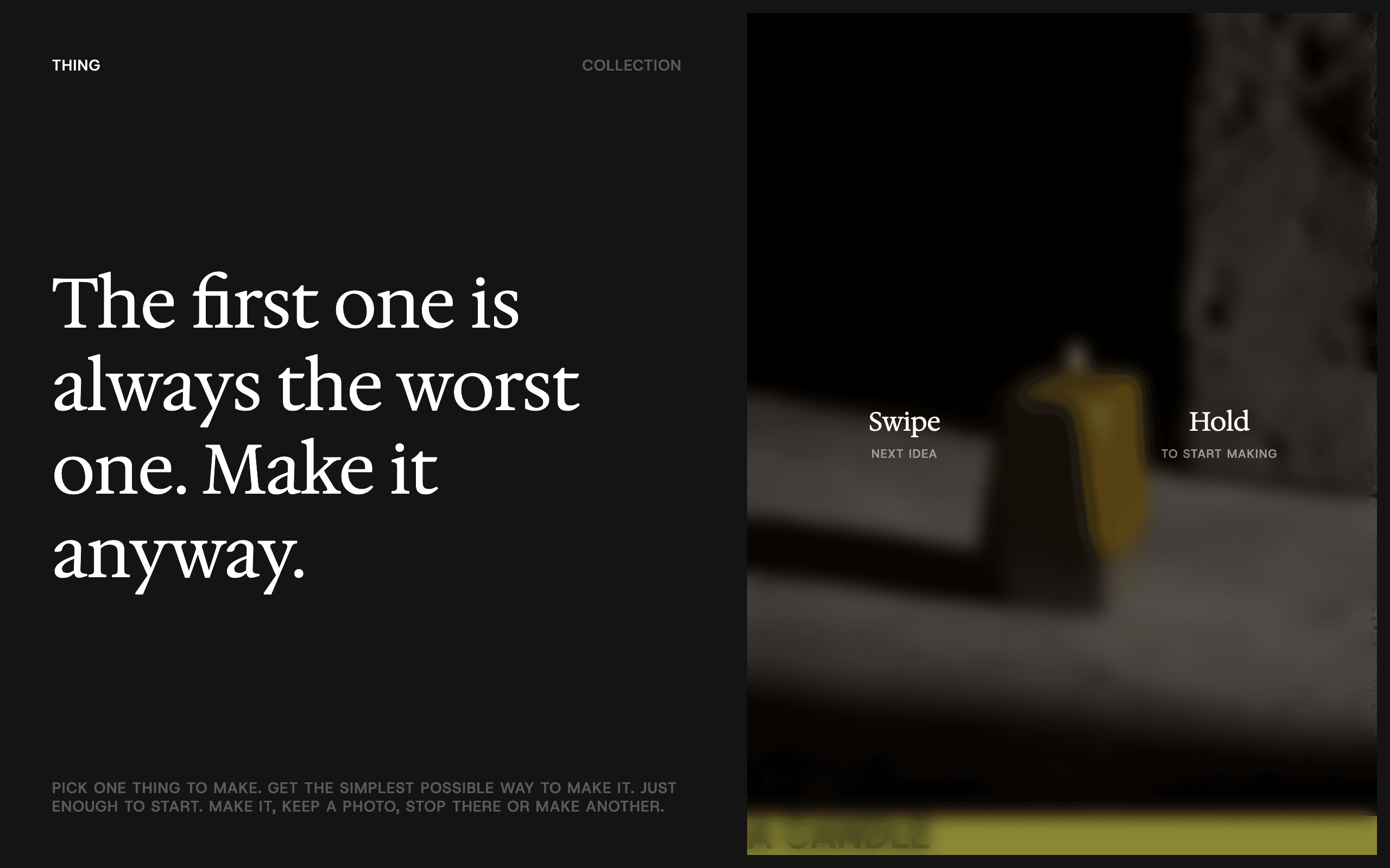
Committing is a press-and-hold. Starting should feel like a small decision, not something you slip into by accident. So you don't tap to enter making mode, you press and hold. It's slower and a little unconventional, and that friction is the whole point. I wanted the commitment to show up in the gesture itself.
The word "hobby" never appears. Calling something a hobby makes it optional, and it makes it part of who you are. Both of those raise the stakes for someone who hasn't made anything yet, so the word shows up nowhere in the product. There's a real cost to that. I gave up the category's whole "find your hobby" framing, which is familiar and easy to search for. What I got instead is a lower barrier to starting, and no cheerleading copy anywhere.
It ends at a photo. The win here is that you leave, not that you keep coming back. You finish, you keep one photo, and that's the end of it. There's no streak, no library to keep up with, and nothing engineered to pull you back tomorrow. This is the trade at its most obvious. I give up the habit mechanics and every metric they'd generate, and in exchange the product stays honest about what it's for.
Outcome
Thing is a concept, and I built it as an argument. The claim is that a hobby app can be designed against its own category's incentives and still hold together as a product. It shows that the loop is coherent, and that I re-decided every category default instead of inheriting it. What it can't show is retention, whether a content pipeline would hold up at scale, or how real people behave. That's the test a two-week makeathon doesn't get to run. Does a first-time maker actually put the phone down and come back with a photo?
Depth
How it got to the name "Thing." The name kept moving before the product settled, and each version showed me what was still off. Make One read like an instruction. Beginner put the user's inexperience right in the title, which is the one thing this product should never do. Primo reached for warmth and landed on cute. It settled on Thing. An object you haven't made yet, with no aspiration and no skill level attached to it. That's the register the whole product needed.
Craft. I art-directed the full visual set and generated it with Midjourney and Weavy, treating what they produced as raw material to work from, not a finished asset. The tone is quiet and editorial, more like a product catalogue than a crafts app. That's most of what sets it apart from the bright, badge-covered look the category defaults to.
App first, process as seasoning. The same plainness carried into the pitch. The app itself is the whole argument; how it got built shows up at the very end as a thirty-second aside, not the headline.
The build. I built it with the same agentic workflow I use on client work. The design system lives as a text file, Claude Code reads from it, and everything syncs into Figma through the Figma MCP. Two constraints ended up shaping the final demo. First, the Figma MCP can write to the Figma Design canvas but not into Figma Make, which is where the prototype actually lived. Second, Figma Make's authentication was flaky enough that wiring up a real login would have eaten most of the two weeks, so the demo runs on pre-populated mock data in a fixed logged-in state. That was a deliberate scope cut, to protect the parts that had to be felt. The one interaction the whole product rests on is the hold-to-commit gesture, and I verified it by driving the live prototype through browser automation, tuning the timing until it read as a decision instead of a lag.
Project Gallery