A film-driven site for an LVMH tequila, moved entirely by scroll
Volcán de Mi Tierra
- Role
- Product Design & Creative Direction
- Scope
- UX, UI & 3D film direction
- Client
- Volcán de Mi Tierra · Moët Hennessy
- Year
- 2025
- Live
- volcan.com
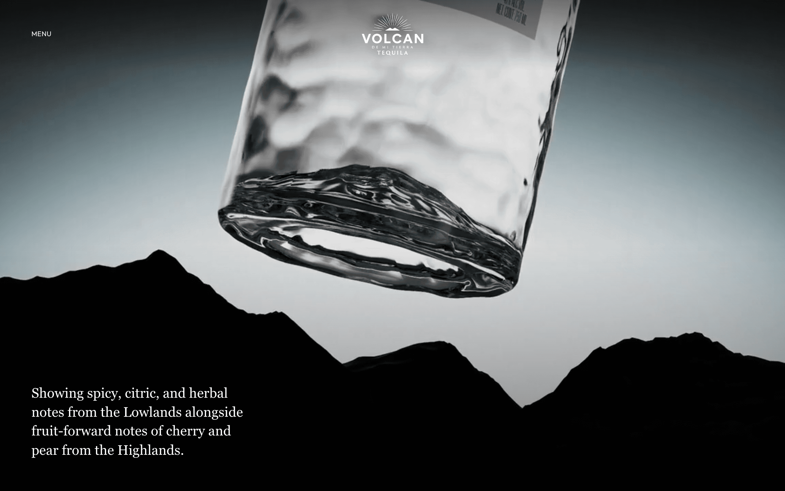
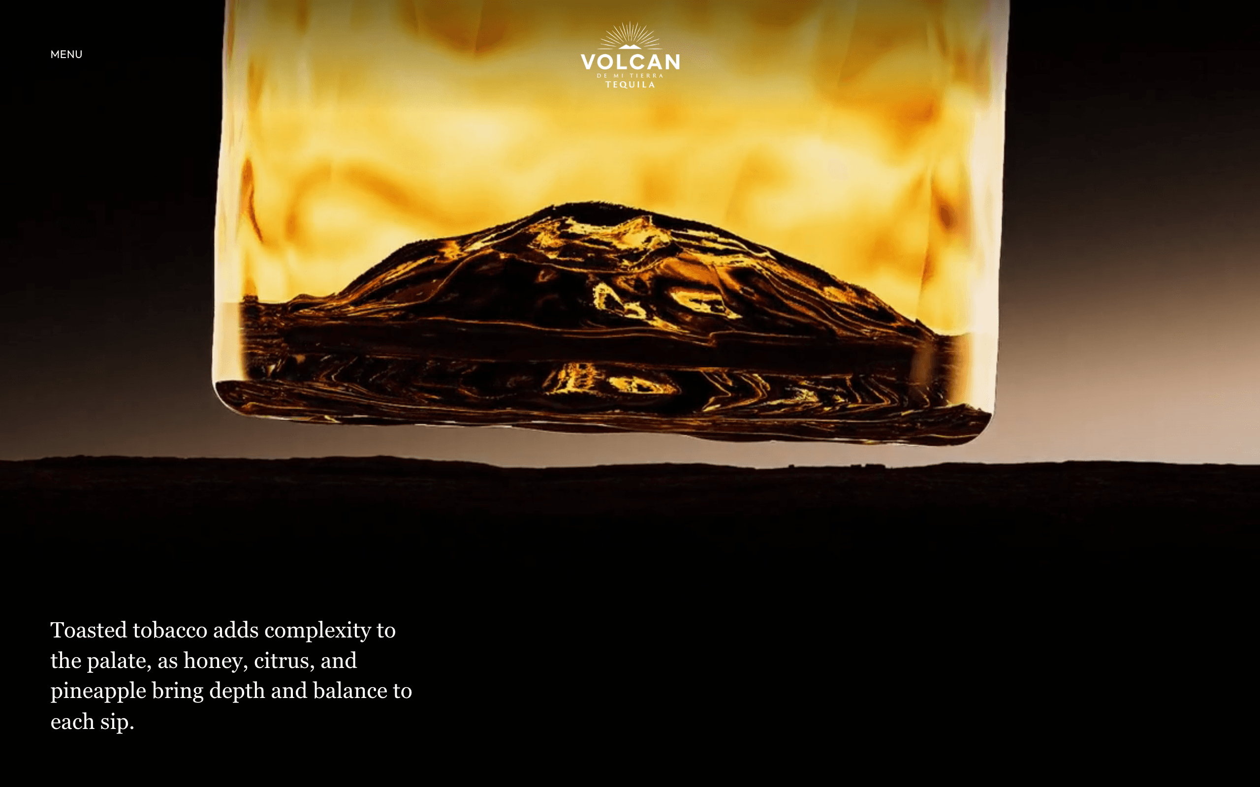
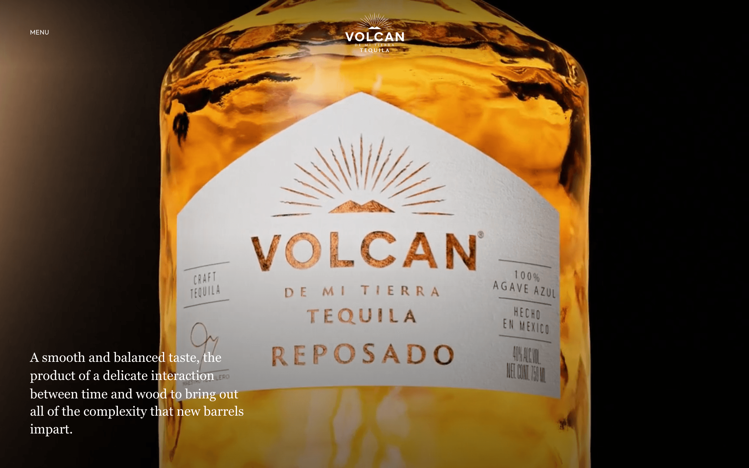
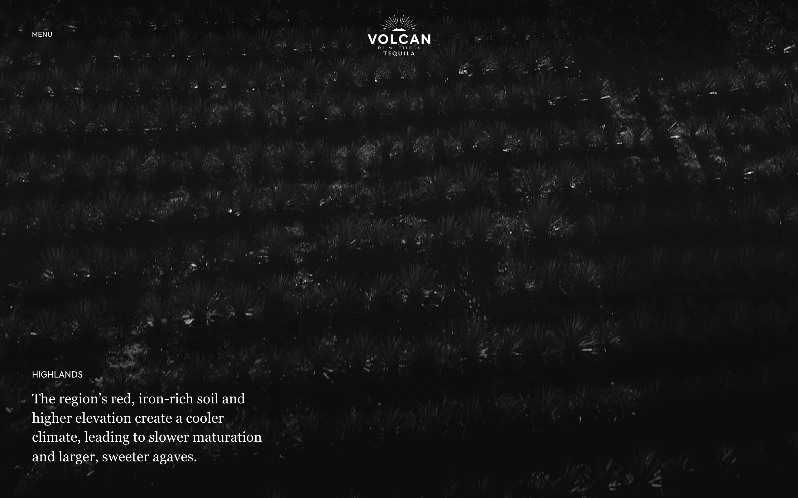
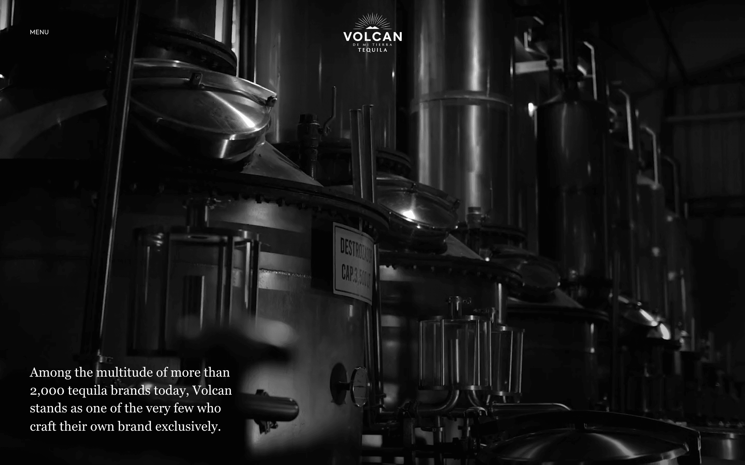
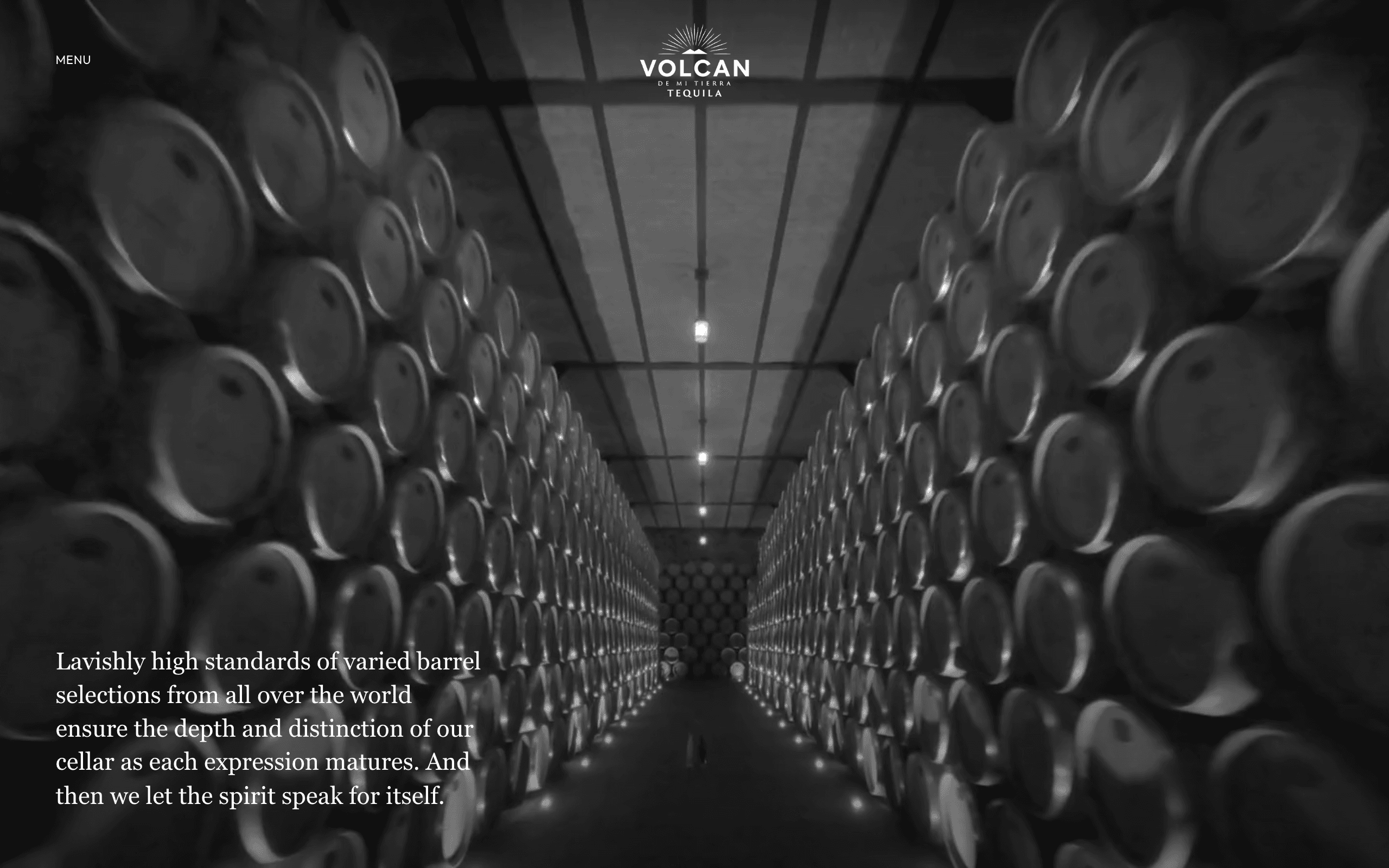
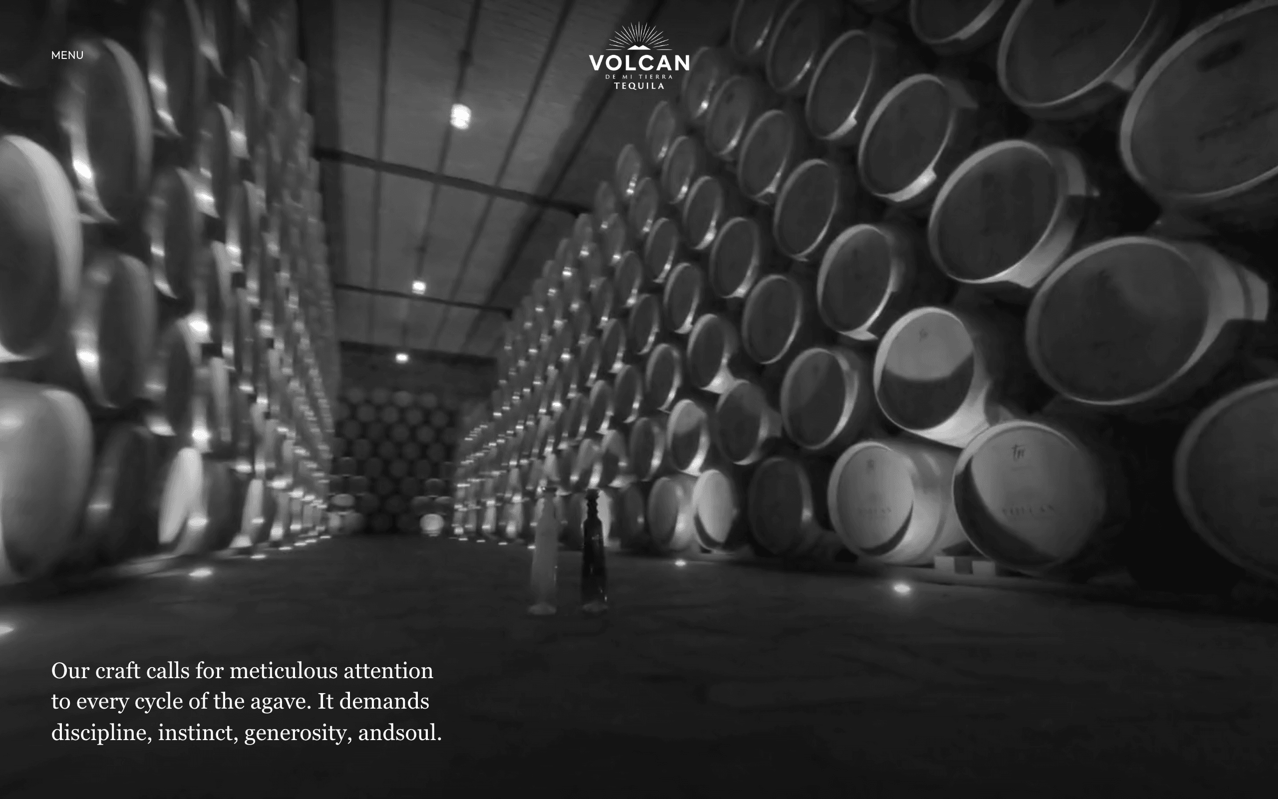
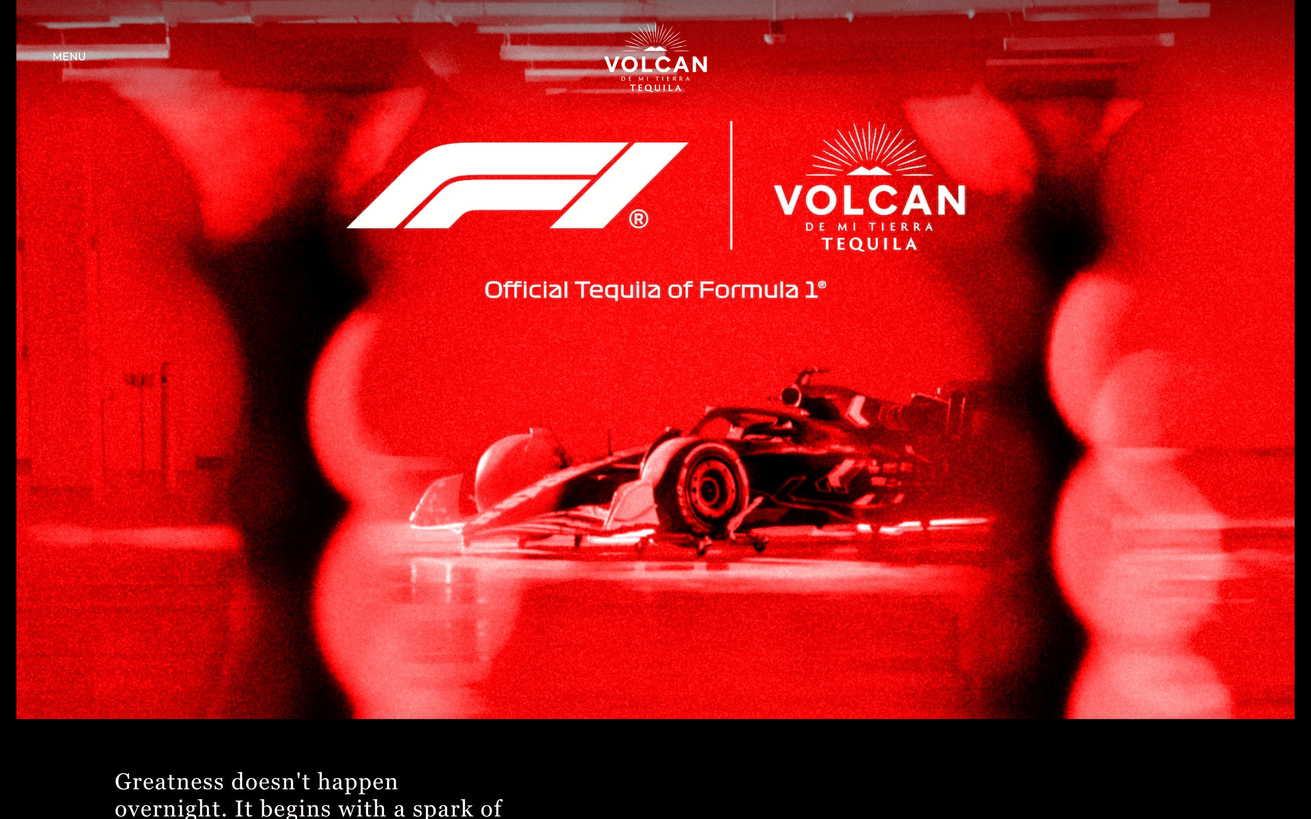
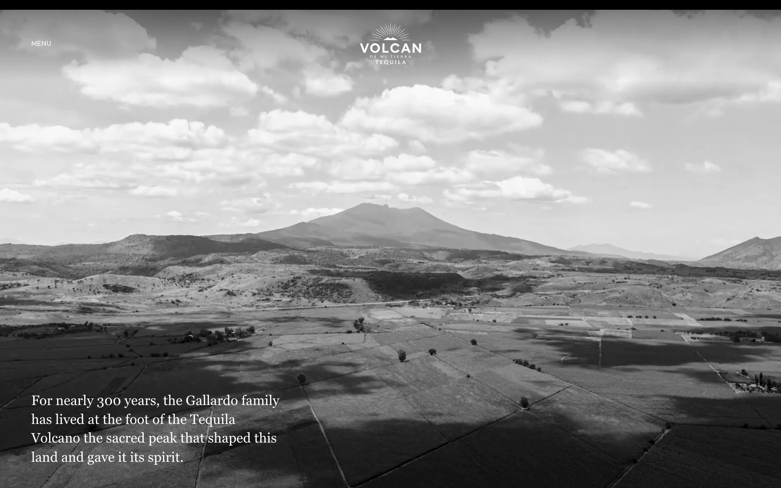
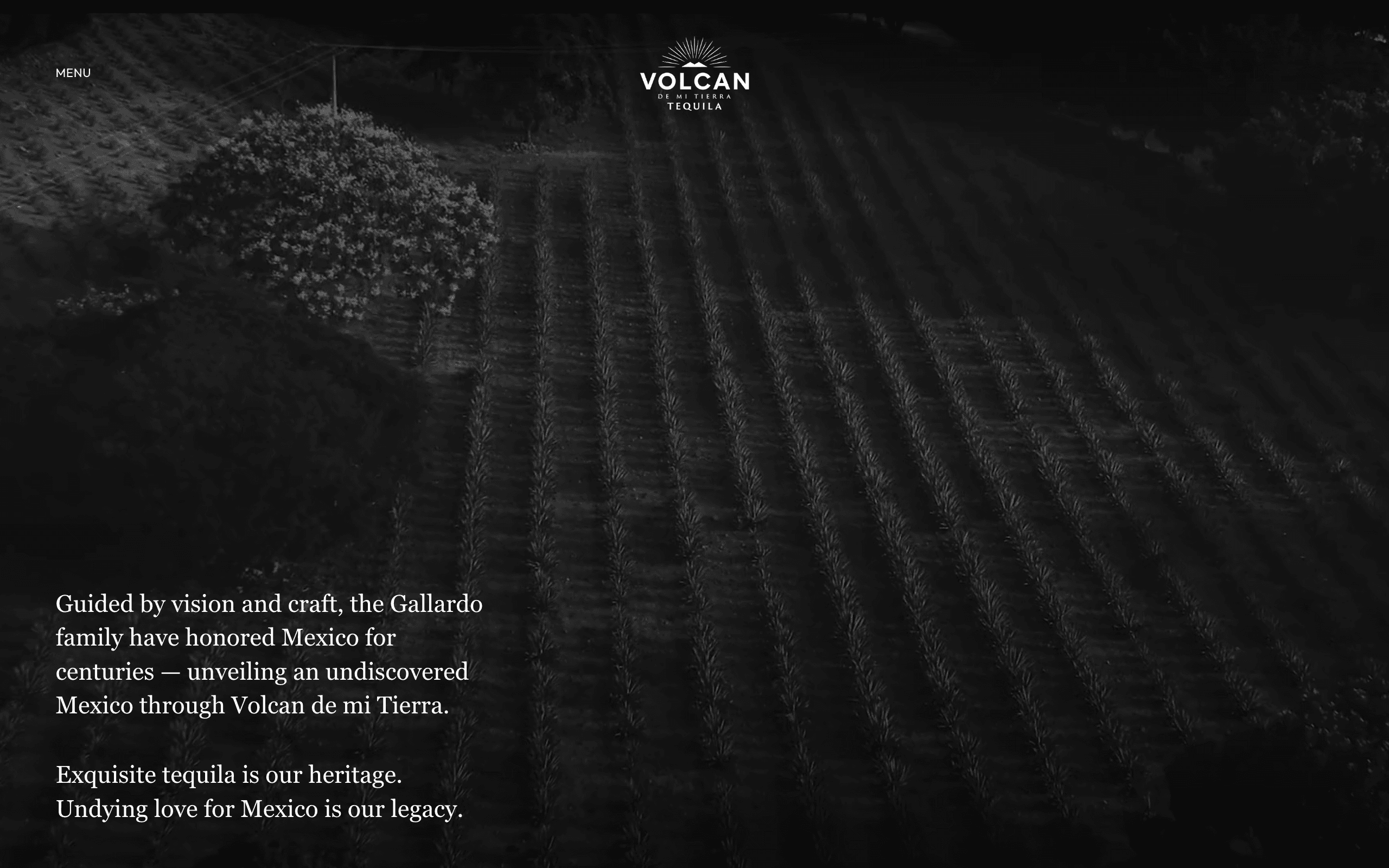
Volcán de Mi Tierra is a tequila under Moët Hennessy. It had just rebranded, moving away from the bright, obvious look most Mexican tequila reaches for toward something quieter and more poetic, and the site needed to catch up. I led design and creative direction on it: the UX and UI of every page, the structure of the product chapters, and the direction of the 3D-rendered product films that carry them. The whole thing is built almost entirely from film, moved by scroll. It grew organic traffic to about four times the old site, with no paid media behind it.
The rebrand
Volcán had already left the obvious language of Mexican tequila behind: the bright color, the festivity, the cliché. The new identity was quieter, more poetic. The site had to be the clearest expression of that. Making it a tidier version of the old one was never going to be enough.
The risk was in the category's defaults. A product grid, festive photography, buy-now buttons: any of that drags the site straight back to what the rebrand was leaving, and none of it holds at the level an LVMH maison expects. So the bar was high. The site had to feel as considered and physical as the bottle itself.
Role and constraints
I led design and creative direction across the whole site, down to the UX and UI of every page. I defined the structure of the product pages myself and presented it to the brand's leadership. I directed the external 3D partners who produced the product films, and I helped pick and edit the cinematic footage that sets the tone of each page. Working alongside the technical team, I kept refining the feel of the experience until it was right: the smoothness of the scroll, its speed, the transitions between sections. And I was part of the team working directly with the brand, keeping timelines and expectations aligned across stakeholders. The site is built almost entirely from video, full-bleed and app-like, structured as a near-linear scrollytelling sequence.
Decisions
Every decision below makes the same trade. I gave up web defaults, like random access, skimmable text, quick comparison, and the browser's own scroll, for one authored experience that holds the brand's standard.
Chapters, not a catalogue. I structured the product pages as a linear sequence of chapters and presented that to the brand's C-suite. You move through the site, you don't browse it. That costs random access and easy comparison, and in return each product arrives in its own moment, on a single authored path.
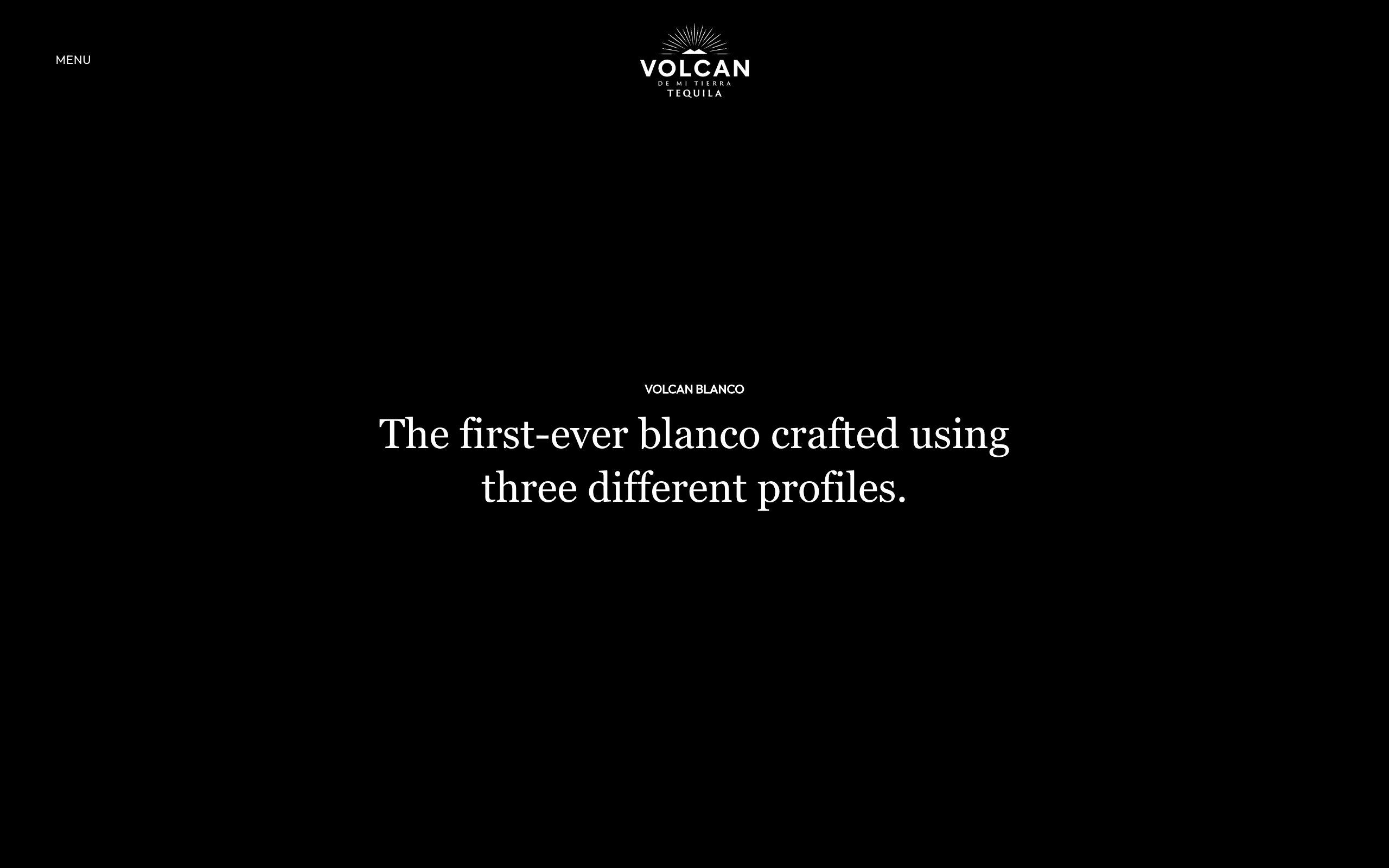
A "next chapter" footer instead of a menu. When the whole thing is a near-linear scroll, the natural move at the end of a page is forward, not back up to a menu. So the footer just carries a direct link to the next chapter. You lose conventional menu wayfinding, but the momentum through the story never breaks.
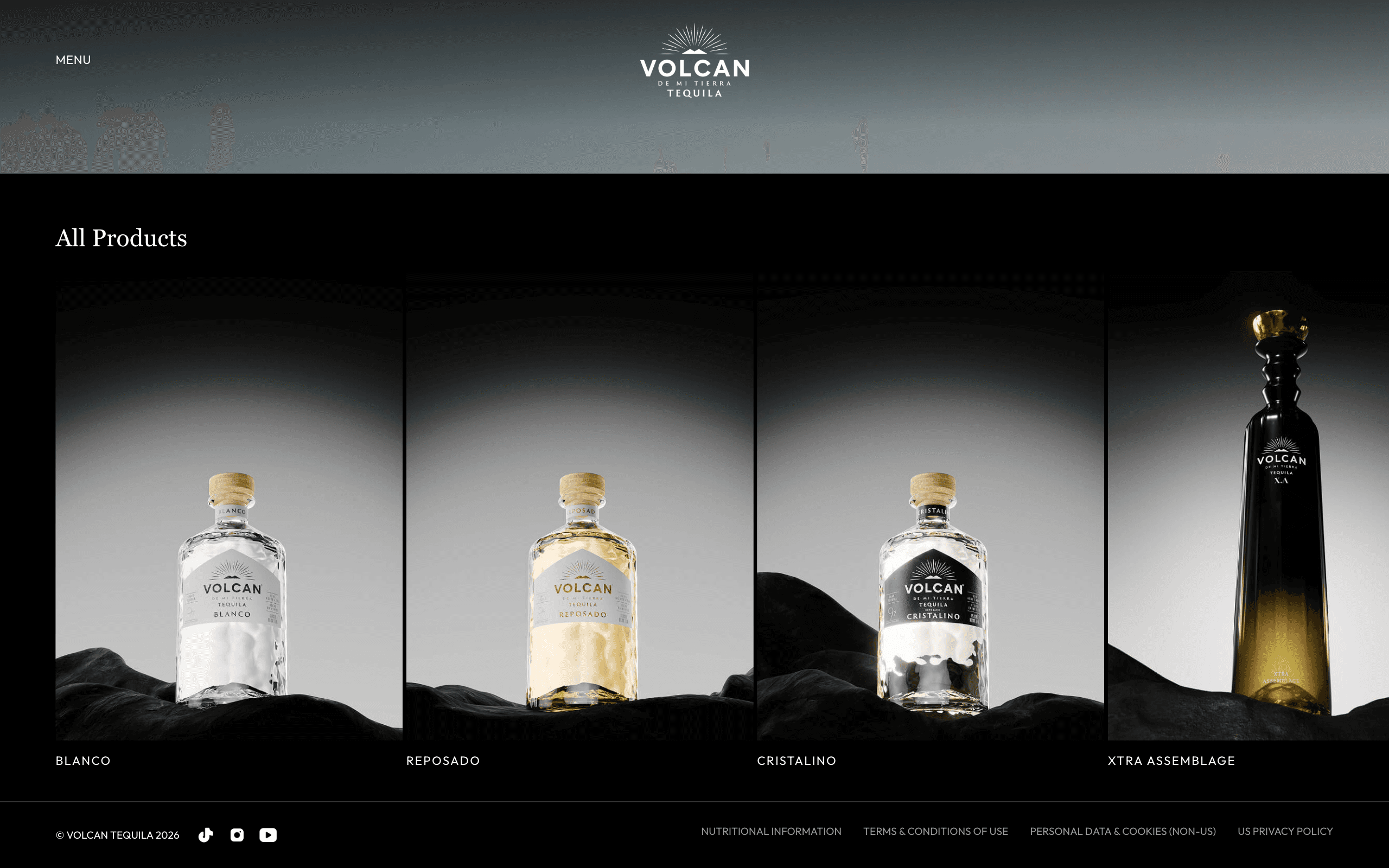
Let the 3D product films be the centerpiece. The product films, produced by external 3D partners under my direction, are the high point of the site, and every chapter is built to hand off to them. Stills would have been cheaper and lighter to load. But film gives the bottle a sense of presence photography can't reach, and on this brief that was the whole point.
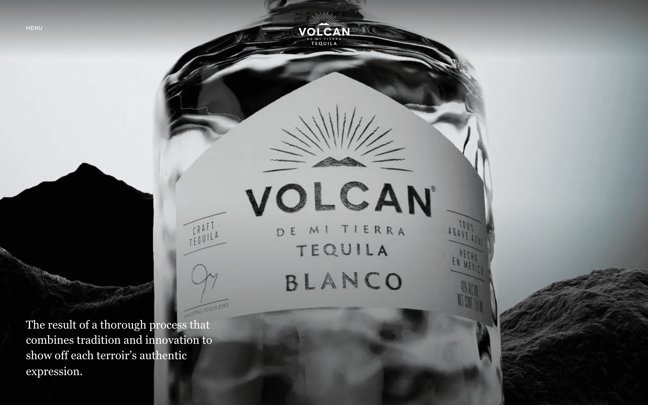
Cocktails as an interactive recipe video, not photos and text. Everyone else shows a cocktail as a photo plus a text recipe. I built something else. The recipe plays as a video with the steps synced to it, built for mobile, the way Spotify syncs lyrics to a song. You give up the skimmable, search-friendly list, and in exchange the recipe holds attention and reads as premium on a phone.
The scroll is the interface. The site moves almost entirely by scroll, so the scroll is the interaction itself, not just a way to reach the content. With the technical team I tuned its smoothness, its speed, and the section transitions until the motion felt deliberate. The browser gives you scroll for free; this one I had to build by hand, and it's most of what makes the whole site feel physical.
Outcome
The new site grew organic traffic to about four times the old one, with no paid media behind it. Organic growth is never design alone, I know that, but hitting it with zero paid support is the part the experience earned. The relationship held too: the brand had commissioned this kind of work before and came back for it. The work is end-to-end craft and creative direction at a luxury standard, owned across UX, UI, and the direction of the film.
Depth
The interim site, shipped solo. While the main build was in progress, I designed and built a temporary site on my own in Webflow, so the brand wasn't dark during the gap. It's a different kind of proof from the flagship: that I can ship a complete, on-brand presence independently, and fast, when the situation calls for it.
Coordinating a luxury client. Presenting the product-page structure to the CMO, COO, and CEO and getting it approved is a different skill from designing it. I worked directly with the brand as part of that team, keeping timelines and expectations aligned across stakeholders. That's the part of client work that decides whether good design actually ships.
Project Gallery